On this page
How-to
Choose light, dark or high contrast
Theme sets Starboard's colours to light or dark, or to match your device, and High contrast makes text, borders and the focus outline stronger in either. Both are in Display, apply at once, and are kept in the browser you use.
Who it helps
- Dark theme: people who find a bright page tiring or glaring, people with light sensitivity or migraine, and anyone using Starboard in a dark room.
- High contrast: people with low vision or colour vision differences, and anyone in bright light or using a display with poor contrast.
Steps
- Select Display, the last button in the header. The Display and accessibility slide-out opens.
- Under Theme, choose one: - Match device (the default) follows the light or dark setting of your phone or computer, and changes when it does. - Light and Dark stay as they are, whatever the device does.
- To make everything stronger, activate High contrast. Deactivate it to go back.
- Select Done, or press Escape.
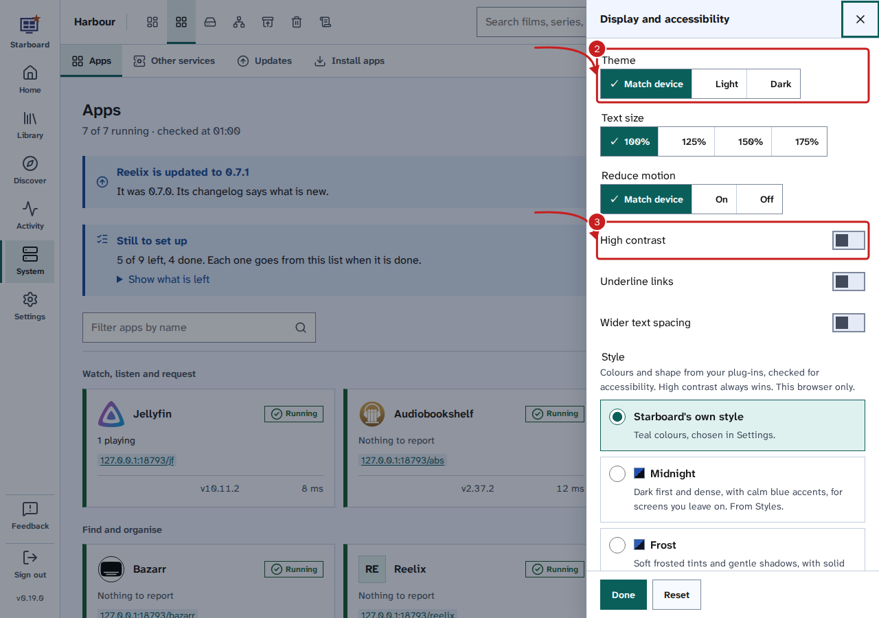
The same choices are in Settings, then General, then Appearance, under Accessibility. Reset in Display puts every choice back to its default.
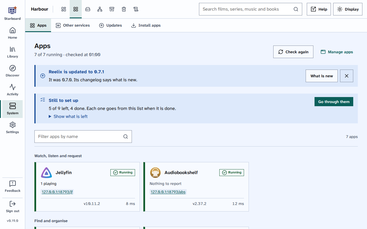
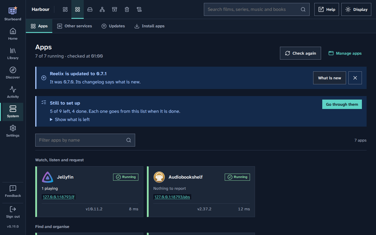
Light and dark
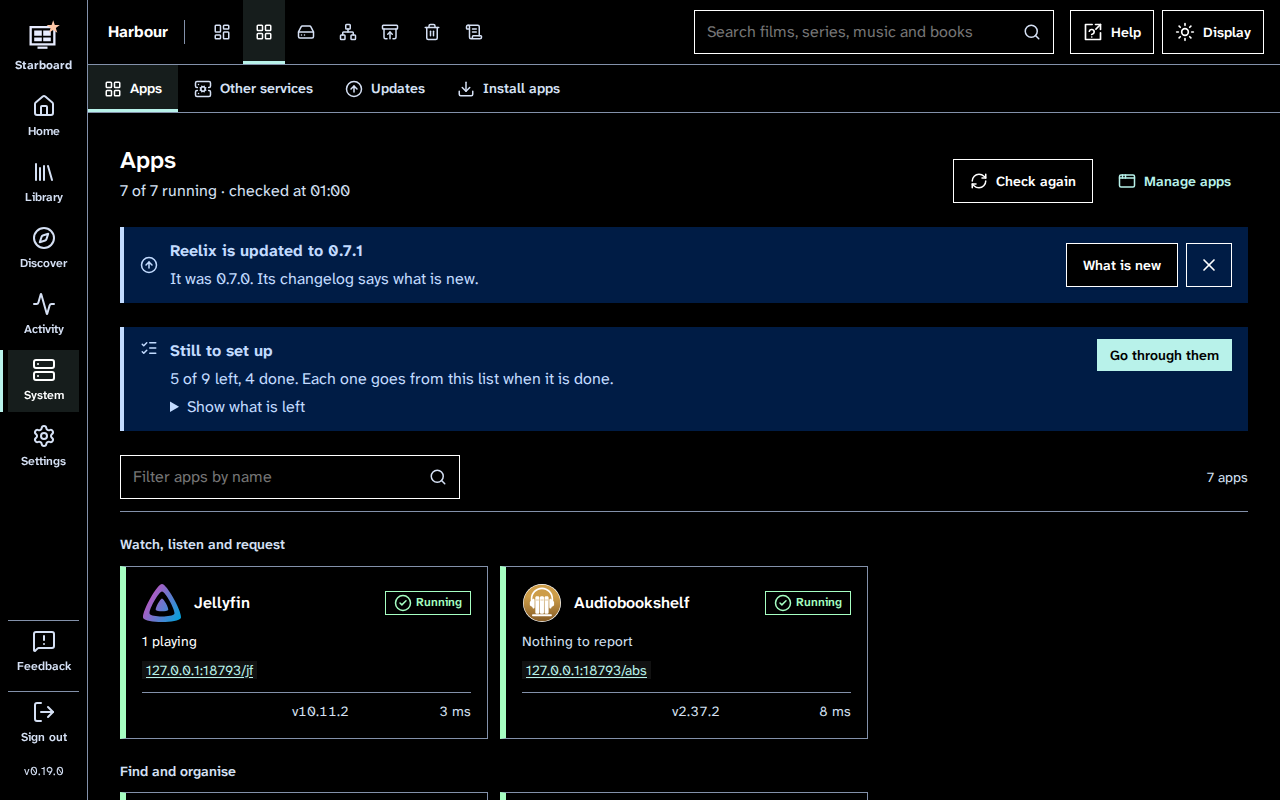
Both themes meet the WCAG 2.2 AA contrast levels: at least 4.5 to 1 for text, and 3 to 1 for the edges of controls and the focus outline. They are checked for every colour pair in the design system.
What high contrast changes
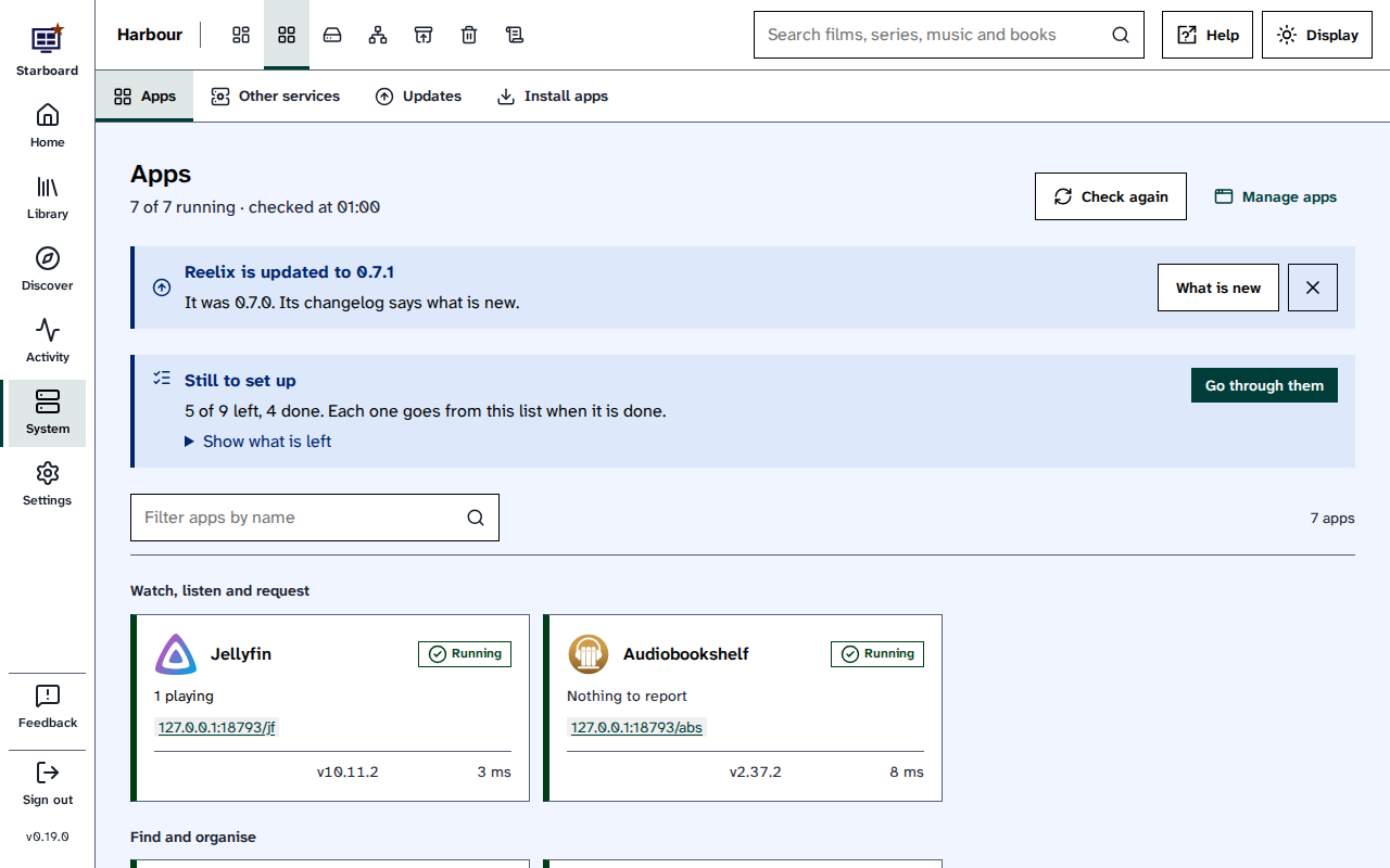
- Text is near-black on white, or white on black in the dark theme. Secondary text is darker or lighter to match.
- Every card, field and button gets a solid black or white border, and shadows are taken away.
- The focus outline turns magenta in the light theme and yellow in the dark theme.
- Charts change to stronger colours, and states keep their words and icons.
- Styles from plug-ins and the own style colours are set aside while it is active.
Styles and colours for everyone
- Styles from plug-ins: a style changes Starboard's colours and shape. Starboard checks every style for contrast in light and dark before it can be chosen. Read Choose a style from a plug-in.
- Own style colours: Starboard's own colours can be chosen for everyone on the server, in Settings, then General, then Appearance. Every one of them passes the same contrast checks.
Things to note
- Theme and high contrast are kept in this browser only. Each phone, computer and browser has its own.
- With Windows' own contrast themes (forced colours), Starboard leaves the colours to Windows and keeps the focus outline visible.
- Pictures, such as covers, keep their own colours in every theme.
Find out more
This page on GitHub, where the help is written.