On this page
How-to
Use Starboard on a phone or tablet
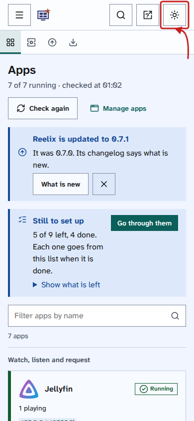
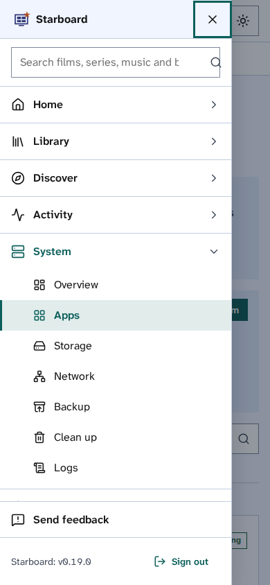
Starboard works in the browser on a phone or tablet, with touch, with the device's screen reader (VoiceOver or TalkBack), and with its own text size, zoom and motion settings. On a narrow display it changes to a phone layout: one column, with the menu under Menu.
When would you use it
- You use Starboard from your phone or tablet, on your home network or away from home.
- You use VoiceOver, TalkBack, Switch Control or Voice Access on the device.
- You want to know which of your device's own settings Starboard follows.
The phone layout
- Menu: the side menu moves under Menu in the header. Each part of Starboard is a section that folds open, and the part you are in starts open. Close menu or Escape closes it.
- Search: the search button in the header opens the search field.
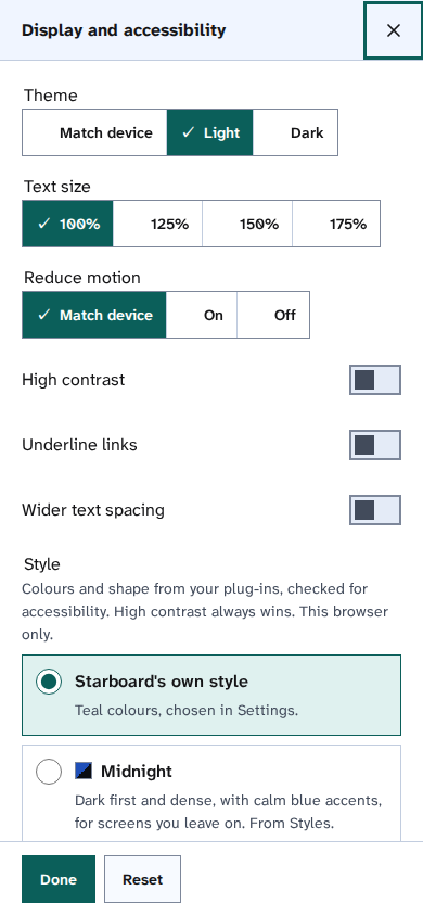
- Display: stays in the header, and opens the same Display and accessibility choices across the width.
- Large targets: every button and row is at least 44 pixels high, so it fits a fingertip.
Your device's own settings
| Device setting | What Starboard does |
|---|---|
| Dark mode | With Theme on Match device, the default, Starboard is dark when the device is. |
| Reduce motion | With Reduce motion on Match device, the default, Starboard stops sliding and smooth scrolling. |
| Pinch to zoom | Never blocked. |
| VoiceOver and TalkBack | Every control has a name, pages have headings and landmarks, and messages are said politely. Read Use a screen reader. |
| A keyboard or switch | Works as on a computer. Read Use only a keyboard. |
| The device's text size | A browser may or may not pass it on to web pages. Use Text size in Display instead, up to 175%. |
Things to note
- Display settings are kept in each browser, so set them on the phone or tablet as well as on the computer.
- Wide tables become a list of cards on a phone, with each value named.
- Every page is checked at 320 pixels wide, narrower than most phones, for anything that needs sideways scrolling.
- You can add Starboard to the home screen of a phone; it then opens in its own window. Read Open Starboard from a phone or another computer.
Find out more
This page on GitHub, where the help is written.