On this page
Accessibility in Starboard
Starboard is built so that everyone can use it: with a mouse, a keyboard alone, a screen reader, voice control, large text or zoom, on a computer, a phone or a television. It is built and tested to WCAG 2.2 level AA (the Web Content Accessibility Guidelines), the standard most public services use. This page says what Starboard does, and links to every accessibility article: how to change it for you, the ways to use it, and how it is checked.
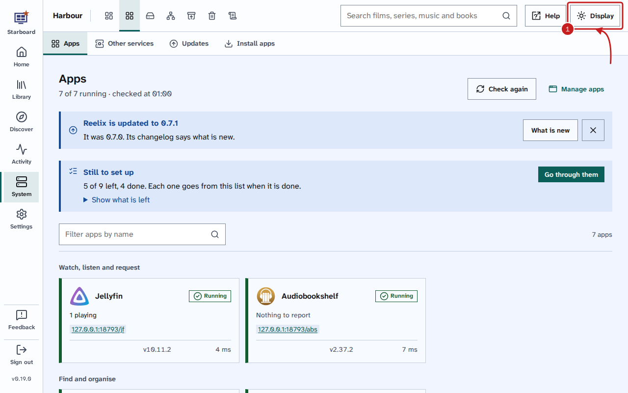
Most of the choices are in Display, the last button in the header of every page, including Sign in and the set-up. Read Change text size, theme and other display settings.
What Starboard does for everyone
These are always on. Nothing needs to be activated.
- Readable type: every page uses Atkinson Hyperlegible Next, a typeface designed for readers with low vision. It comes with Starboard.
- Strong colours: text and controls meet the WCAG 2.2 AA contrast levels in every theme: at least 4.5 to 1 for text, and 3 to 1 for the edges of controls and the focus outline.
- Large controls: buttons and fields are 44 pixels high, and nothing anyone needs to select is smaller than 24 by 24 pixels.
- Keyboard first: everything works with the keyboard, with a thick focus outline that the sticky header never covers, and Skip to main content as the first Tab on every page.
- Screen readers: every page has landmarks, one main heading and headings in order. Short messages, such as Saved, are said without moving you, and problems are said beside the field they are about.
- Never by colour alone: states are shown in words with an icon, and the second line of a chart is dashed.
- Charts as tables: each chart has a sentence that says what it shows, and Show as a table.
- Nothing moves by itself: no slide-out opens on its own, and focus never jumps to the top of the page after a save or a delete.
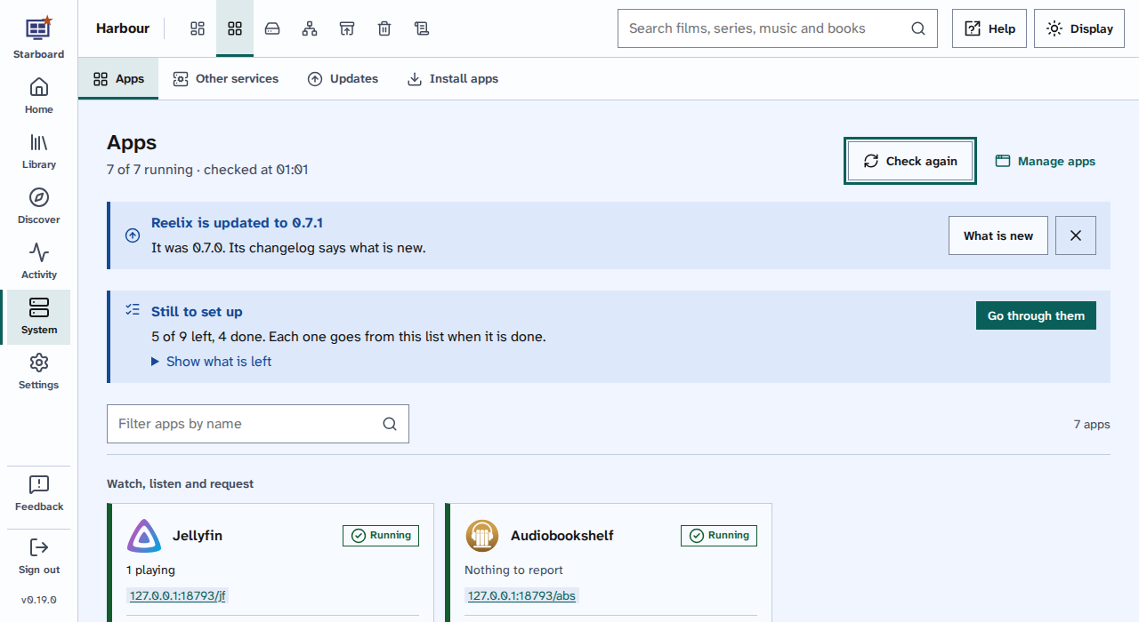
Change it for you
Each of these is in Display, applies at once and is kept in your browser.
- Text size and spacing: text from 100% to 175%, and wider spacing between lines, letters and words.
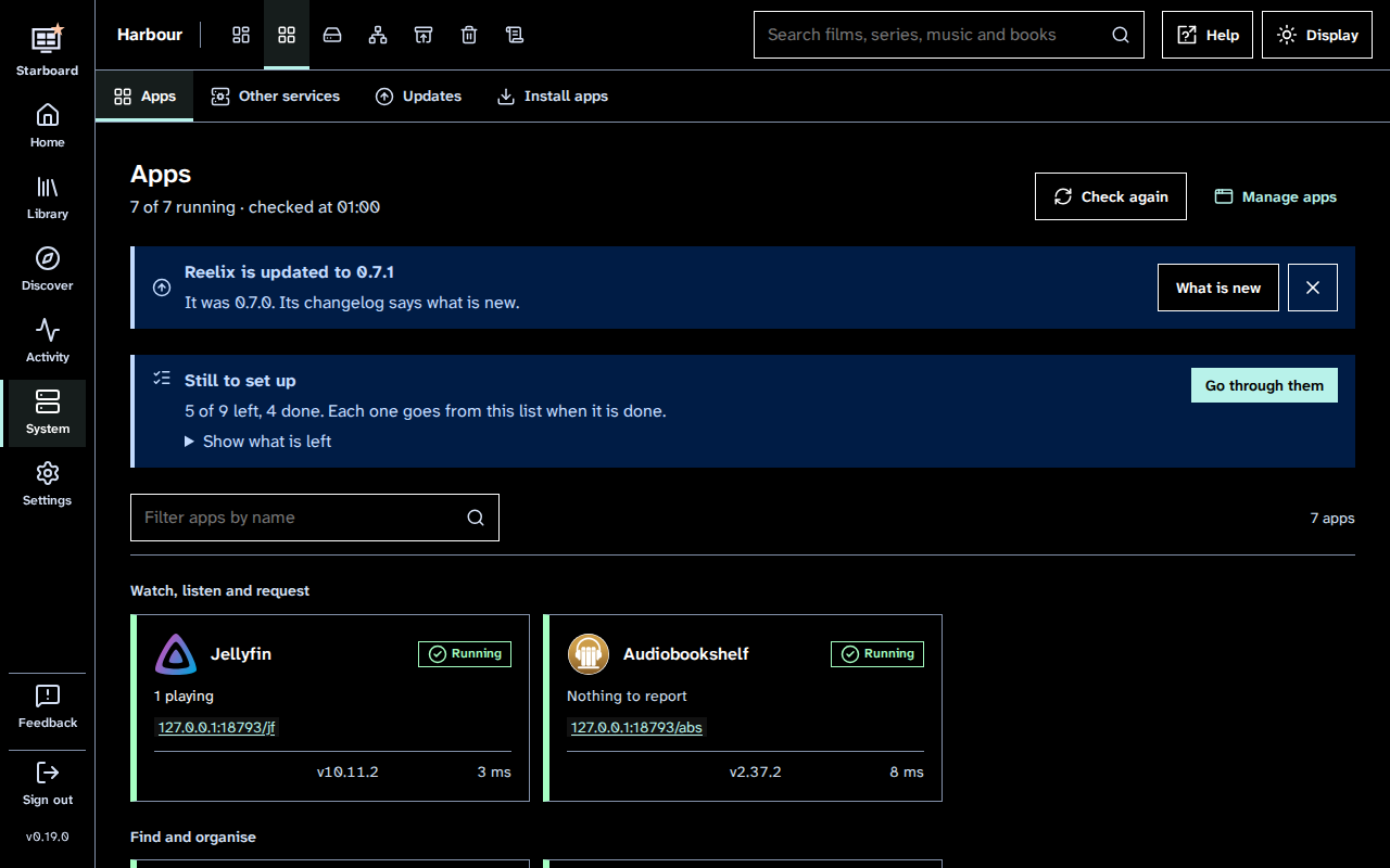
- Light, dark and high contrast: the theme, and stronger colours and borders.
- Reduce motion: no sliding, shimmering or smooth scrolling.
- Underline links: every link underlined, not shown by colour alone.
Ways to use it
- Use only a keyboard: the keys, the skip link, the focus outline, and how slide-outs and dialogs keep and give back focus.
- Use a screen reader: landmarks, headings, what is said, forms, tables, charts and plug-in cards.
- Zoom and large screens: browser zoom up to 400%, text size, and televisions.
- On a phone or tablet: the phone layout and menu, touch, and your device's own settings.
How it is tested
- How Starboard is tested: the tools and steps, and when they run.
- Latest test results: the figures from the most recent runs, with their dates.
- Limits and known gaps: what is not tested, what Starboard cannot control, and open issues.
- Tell us about an accessibility problem: tell us about anything that is hard to use with your tools or needs.
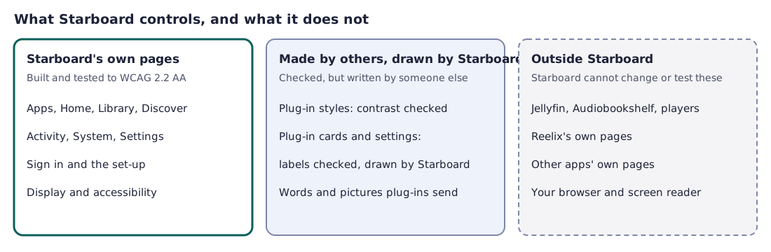
The diagram sorts the pages and tools you use into three groups. Starboard's own pages are built and tested to WCAG 2.2 AA. Plug-in styles and cards are made by others, but checked and drawn by Starboard. Jellyfin, Audiobookshelf and their players, Reelix's own pages, other apps' own pages, and your browser and screen reader are outside Starboard's control. Read Limits and known gaps.
Find out more
- Change text size, theme and other display settings
- Set up everything with the Run first script, which has an accessible mode for the terminal
- Send feedback about a page
- What Starboard is
This page on GitHub, where the help is written.