On this page
How-to
Change text size and spacing
Text size makes all of Starboard's text up to 175% bigger, and Wider text spacing adds space between lines, letters and words. Both are in Display, apply at once, and are kept in the browser you use.
Who it helps
- Text size: people with low vision, people who read better with larger text, and anyone reading from a distance, such as from a television.
- Wider text spacing: people with dyslexia, people with low vision, and anyone who finds crowded text hard to follow.
Steps
- Select Display, the last button in the header. The Display and accessibility slide-out opens.
- Under Text size, choose 100%, 125%, 150% or 175%. The text changes behind the panel at once.
- To add space between lines, letters and words, activate Wider text spacing. Deactivate it to go back.
- Select Done, or press Escape.
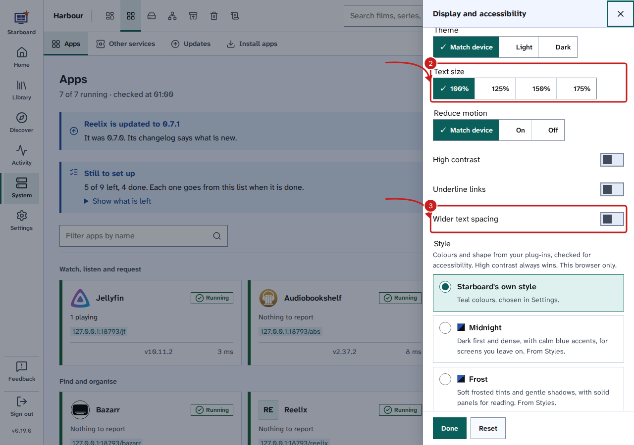
To go back, choose 100% and deactivate Wider text spacing, or select Reset to put every Display choice back to its default. The same choices are in Settings, then General, then Appearance, under Accessibility.
What text size changes
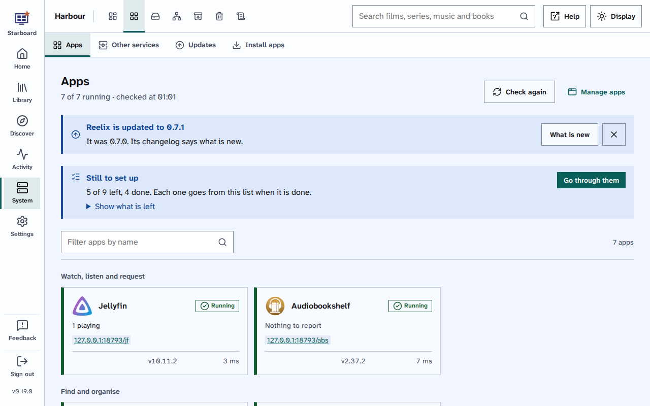
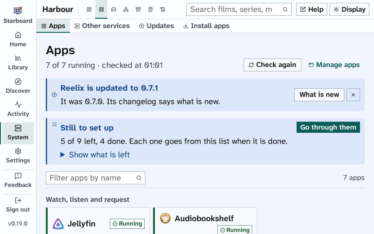
Text size makes every word bigger: headings, menus, buttons, forms and lists. Controls grow with their words. The page is laid out again to fit, so you do not need to scroll sideways. 100% is the default.
What wider text spacing changes
Wider text spacing sets the space between lines to 1.8 times the text size, between letters to 0.12 of the text size, and between words to 0.16 of the text size. These are at least the amounts in WCAG 2.2's text spacing check. Text takes more room, so pages are a little longer.
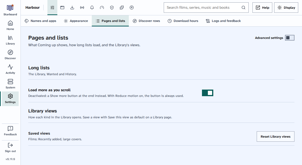
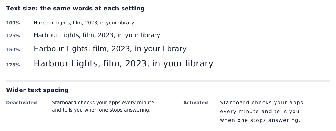
The graphic shows the line "Harbour Lights, film, 2023, in your library" at each of the four sizes, each larger than the last, then a sentence with normal spacing beside the same sentence with wider spacing, which takes three lines instead of two.
The side menu grows wider with the text, so its names stay whole. When the header has too little room, it gives way in steps: its menu shows icons only, the search box becomes the Search button, Help and Display show their icons, and last, the menu moves under Menu. Nothing is cut off, and every name is still read out by a screen reader and shown as a tooltip.
Things to note
- These settings are kept in this browser only. Each phone, computer and browser has its own. A private window may forget them when it closes.
- Text size and browser zoom work together. Text size keeps the layout and changes only the text; zoom makes everything bigger, pictures included. Read Zoom and large screens.
- Starboard's typeface, Atkinson Hyperlegible Next, is designed for clear reading, so there is no separate font setting.
- Every page is checked at 175% text for anything that needs sideways scrolling. Read How Starboard is tested.
Find out more
This page on GitHub, where the help is written.